What is Responsive Web Design?
Your customers, as well as any potential new customers, are accessing your website from a lot of different devices — desktop computers, laptops, tablets, smart phones, and any other current or future hand-held devices. All of those devices come in different shapes, sizes, and screen resolutions. Your website should be designed using a Responsive Web Design.
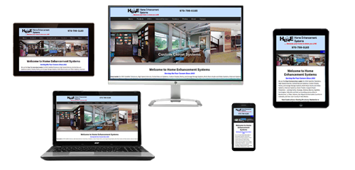
Responsive Web Design means that your website is created so that it is able to automatically adapt the layout and images to any device on which it is being viewed.
Websites have not been designed using a responsive design until recently. Many designers started creating separate "mobile" versions of their websites, which in effect means that you have multiple versions of your website that need to be maintained.
If you've visited websites with your smart phone or tablet and have to continuously scroll left to right and back again, or continuously resize your screen, then that website has NOT been created using a responsive design.
In a website that is created using a responsive design, users across different types of devices and browsers will have access to a single source of content, laid out so it is easy to read and navigate with a minimum of resizing, panning and scrolling.
If your website is difficult to view on smaller devices, then most users will not stay on it for very long.
How does it work?
Responsive web design is coded so that it detects the resolution and screen size of the device the website is being viewed on, and then resizes the content and design to fit neatly within the screen. This allows for an optimal viewing experience for easy reading and navigation, and with minimal resizing and scrolling, no matter what type of device your customers are using to visit your website.
All of our custom websites use responsive design. We're even gone back and re-coded all of our older websites so that they now have a responsive design.
Many companies have separate websites for mobile devices, but with Responsive Web Design all you need is one website. Simply put, a website that employs a responsive web design is coded so that it detects the size of a device's viewing screen and displays the content to fit that device. This works for images as well as text, so that any user is able to easily see all the content on your pages.